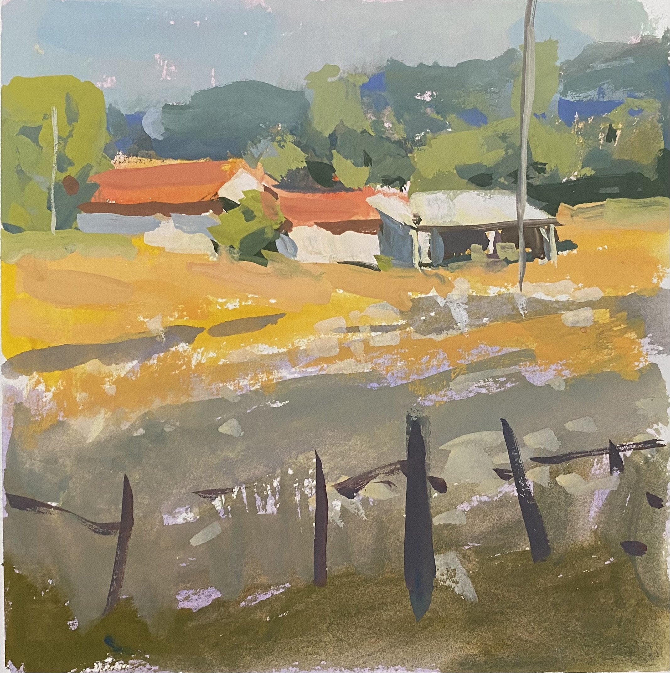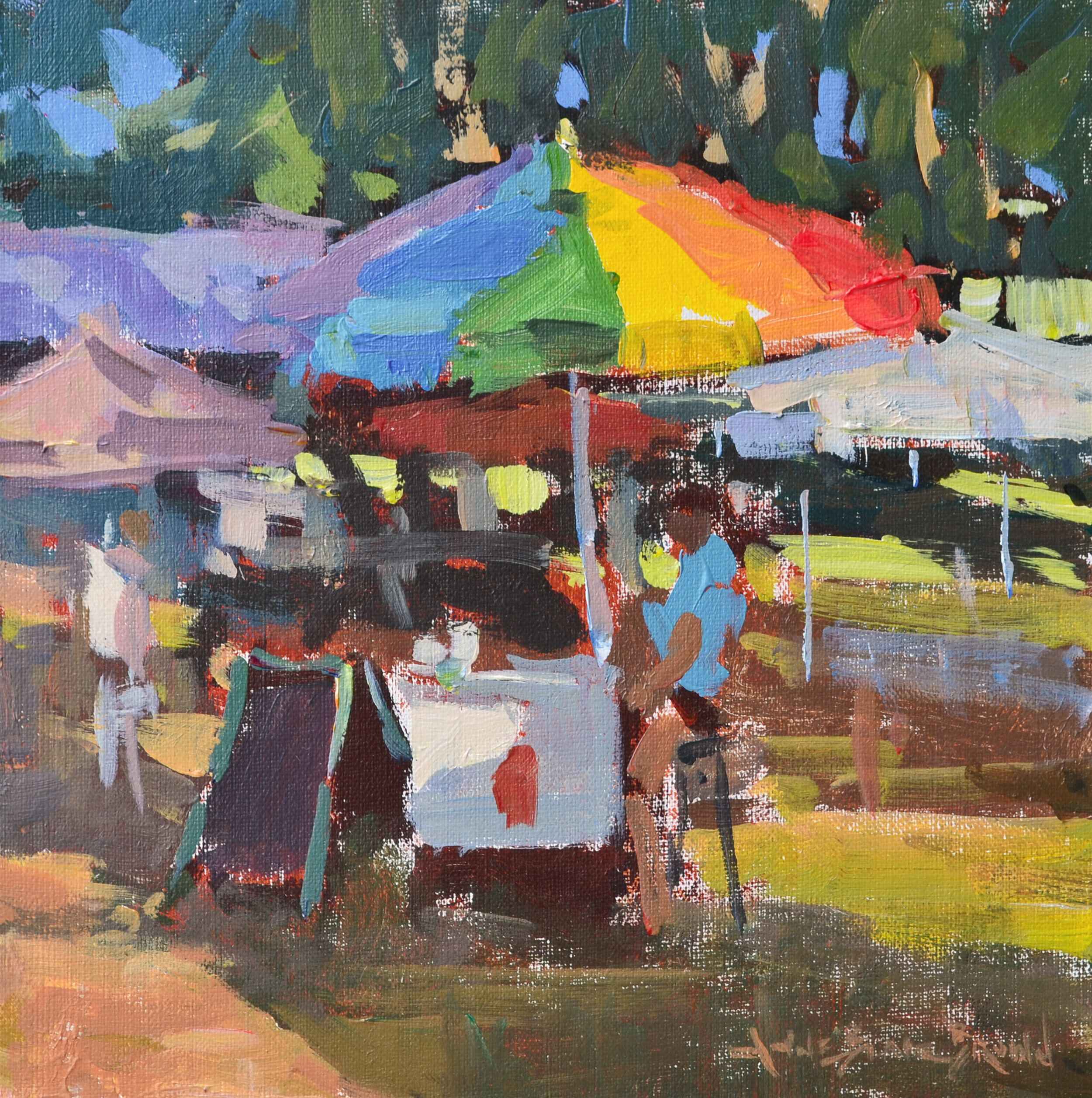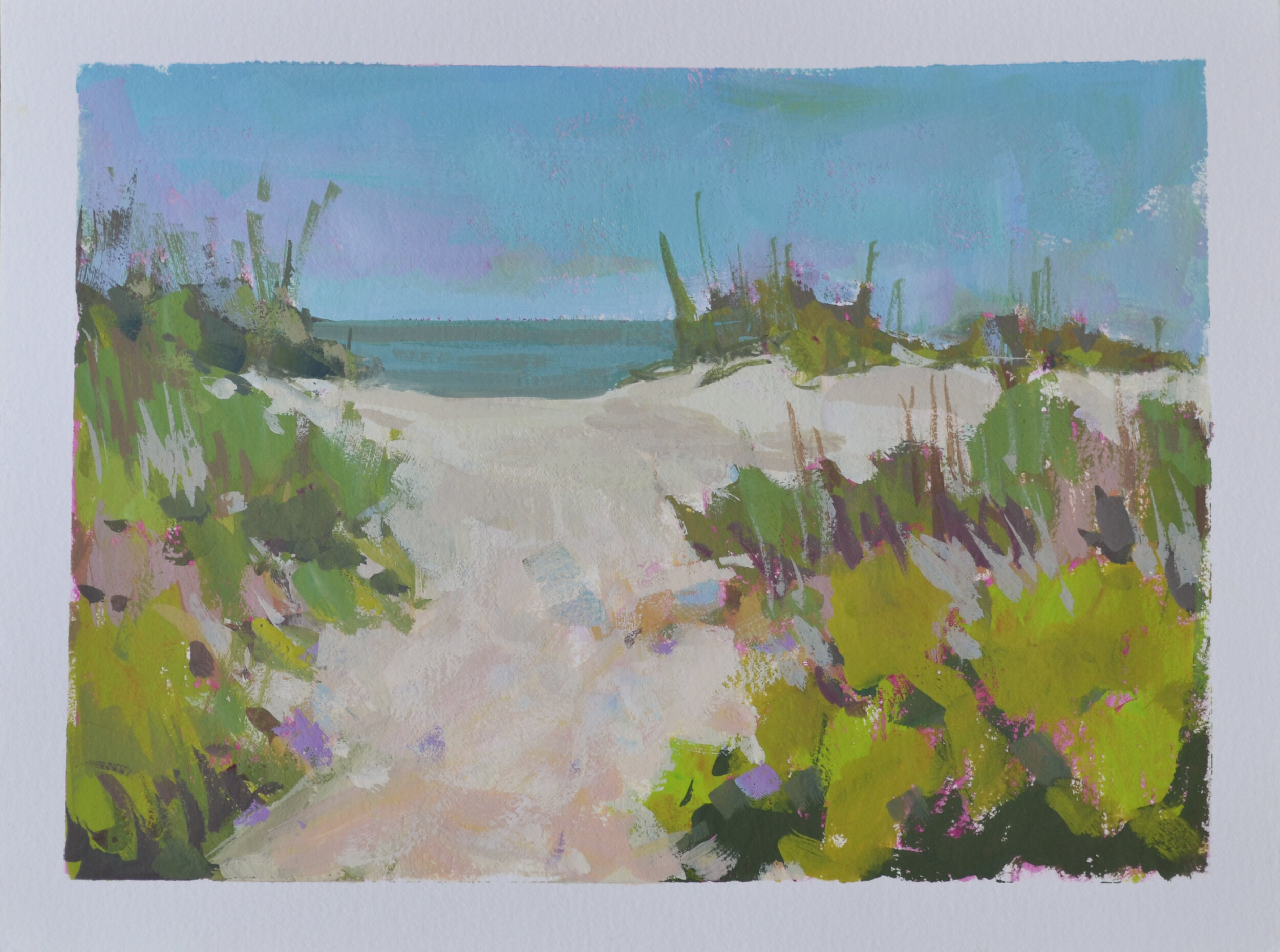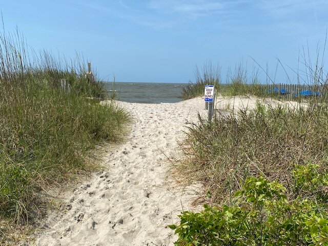

Painting outdoors is my favorite endeavor, no matter what the weather. Capturing light and atmosphere on location has helped me grow as a painter, in and out of the studio. I encourage my students to paint outdoors as often as possible, but I hear many complaints that it is so much work lugging equipment to a location, not to mention a cross-country or overseas trip.
What if I told you that you could paint 20 paintings on a one or two week trip, carrying only 4-8 tubes of paint and 1-2 brushes? What if I explained further that your load would be super lightweight and compact, and clean up and transport of finished paintings would be a breeze? No panel carriers needed! Read on to find out how I have streamlined my outdoor painting equipment to get the most joy out of the plein air experience.
For a while now, I have been singing the praises of acrylics, especially in terms of plein air painting. For the record, I am still an oil painter. I just love to try new things and add a fresh angle to my arty repertoire. Acrylics have actually helped me grow as an oil painter. The fast drying time keeps me on my toes, and that translates to a sense of spontaneity and keeping loose in my oil practice. Please note, the information below can be applied to oil paints, too, with just a few caveats.
Here is a list of equipment I use and have in a backpack at the ready at all times:
• U.Go 8x10 Pochade
• Canson Canva Artboards, 8x10 & 9x12 (comes in tablet of 10 boards)
6x9 Grey Matters Paper Palette
Artists tape (to tape down the palette paper if windy!)
2 synthetic Long Flat brushes, numbers 4 & 6. Hog Bristle ok, too, especially for oils.
• 3-color palette, acrylic or oil: I like Ultramarine Blue, Cadmium Red Light, Yellow Ochre, and Titanium White. Any Primaries will do.
Travel Tripod, lightweight and folds to compact size. Mine is an old Oben ordered through B&H Photo.
Mesh trash bag
Water Cup and Hook
Mini Spritz Water Bottle
Viva
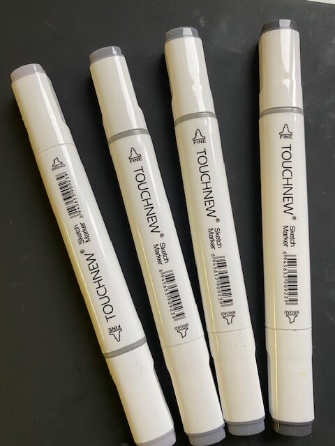
Small sketch Pad with grey marker


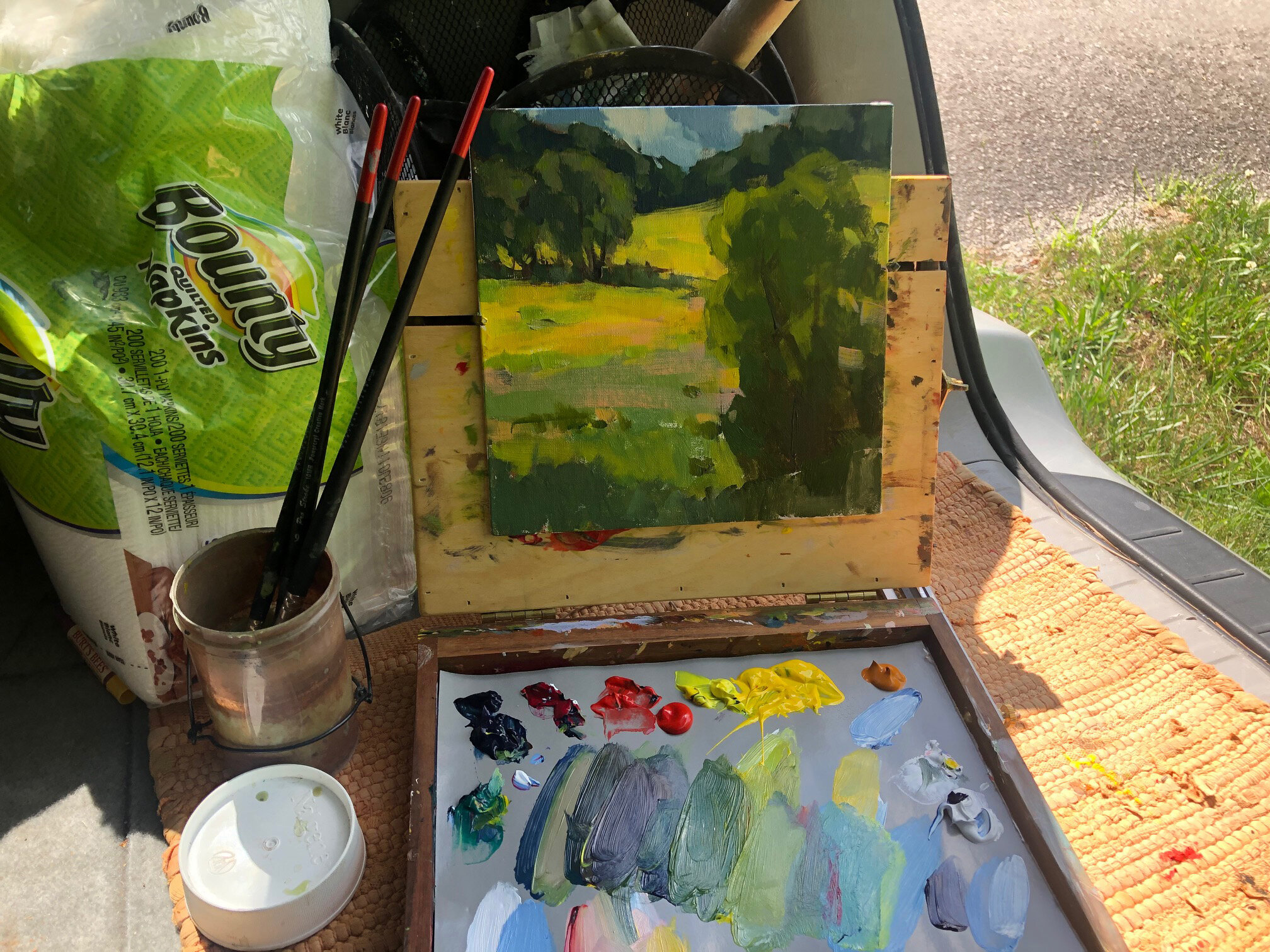
I love the U.Go palette for ease of set up. You just place it on the tripod and open. No hooks or bells and whistles. It stays quite rigid and is very sturdy. My tripod folds up to about 12 inches long and is very lightweight. When I purchased the tripod many years ago, I picked it based on wanting something small and compact but sturdy. Any website will give you dimensions and weight, then you can select based on your preferences.
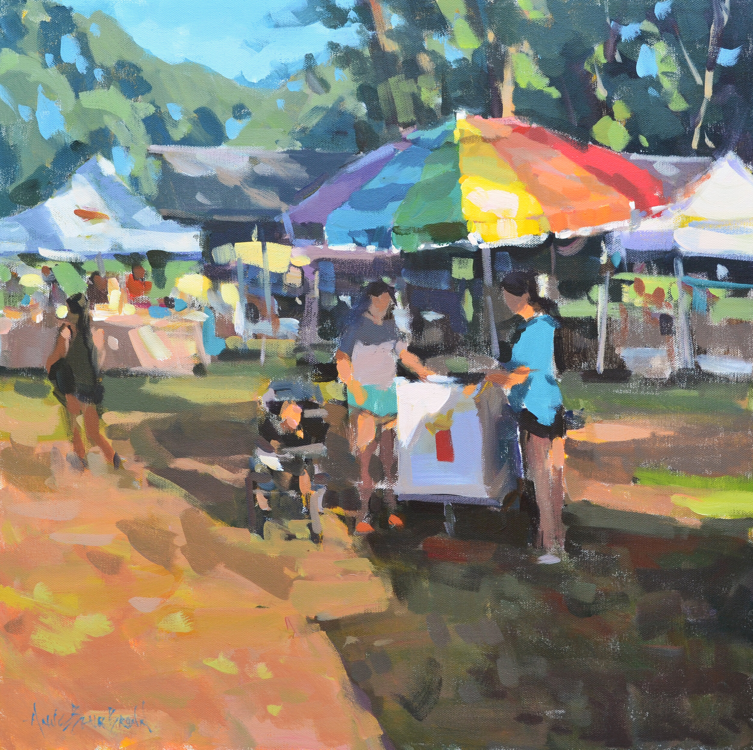
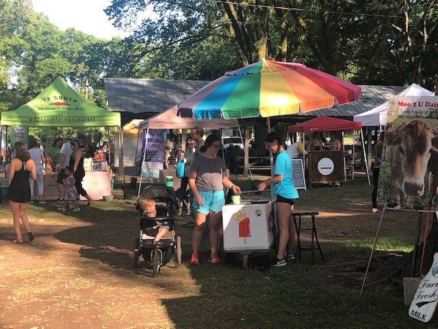
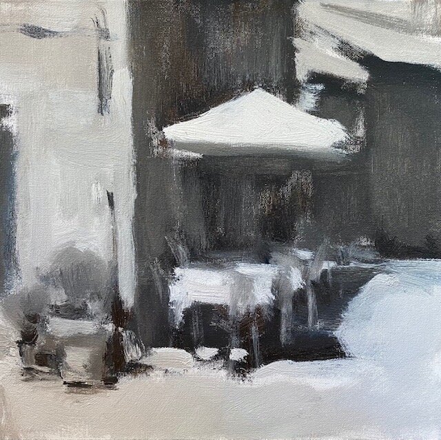
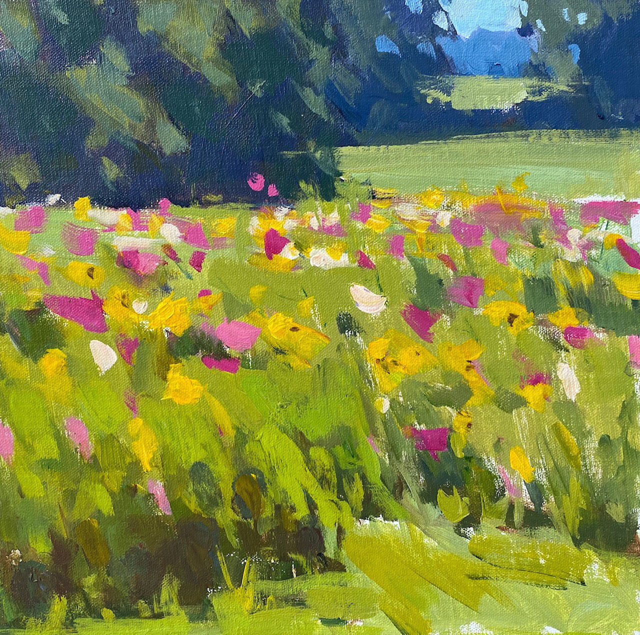
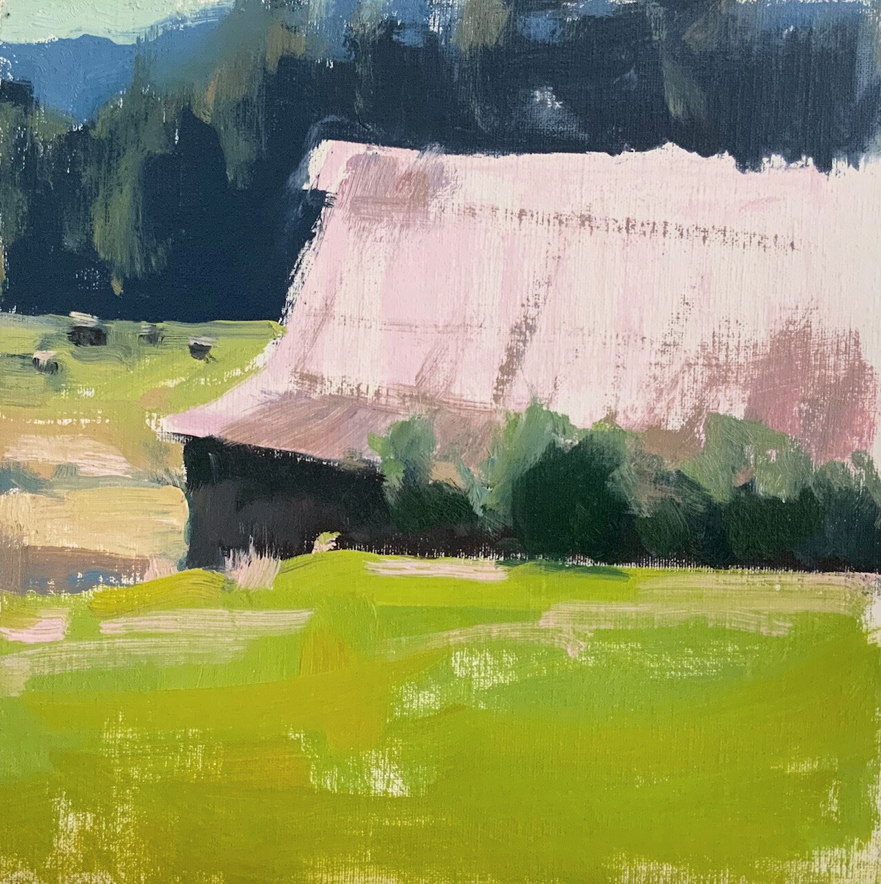
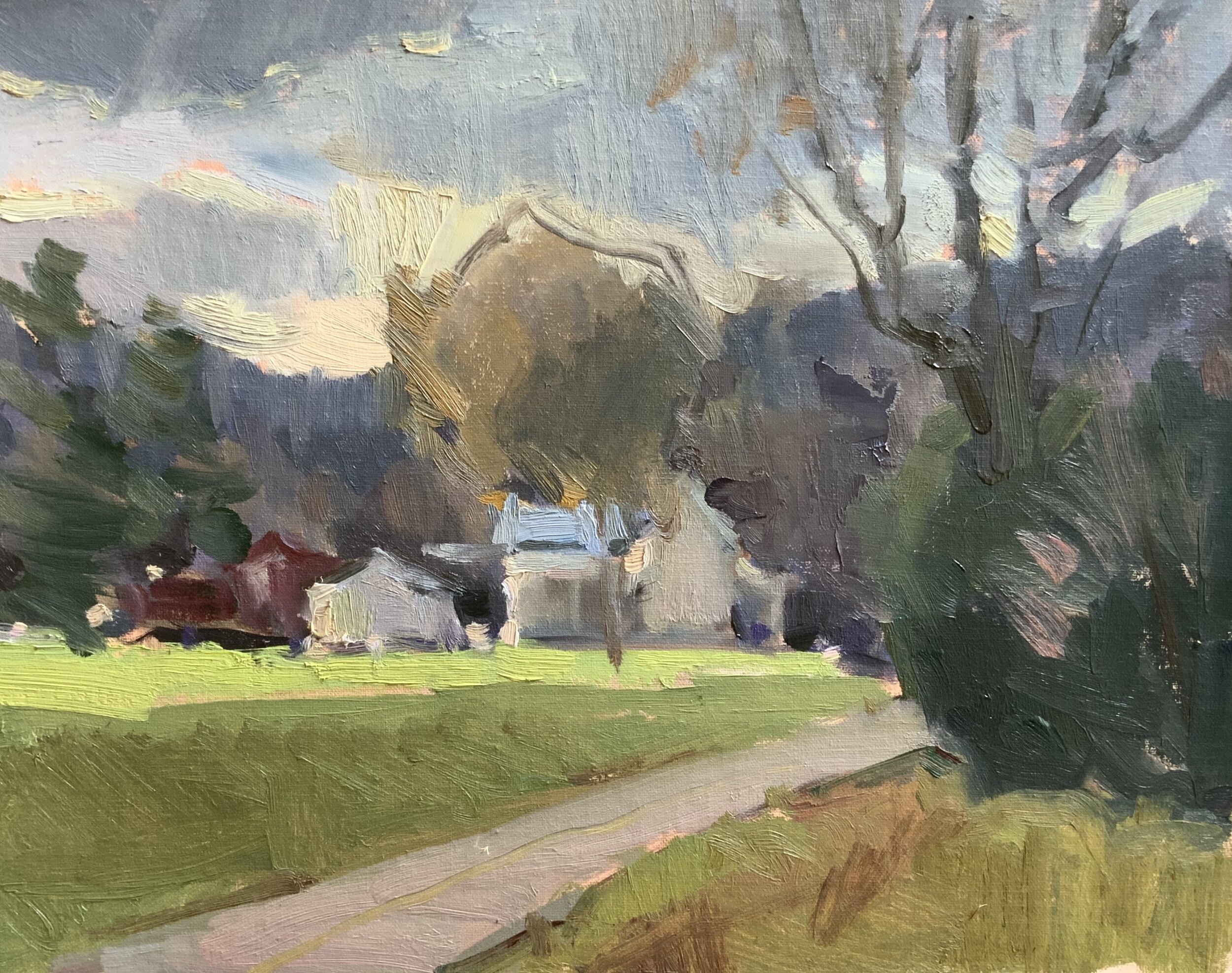
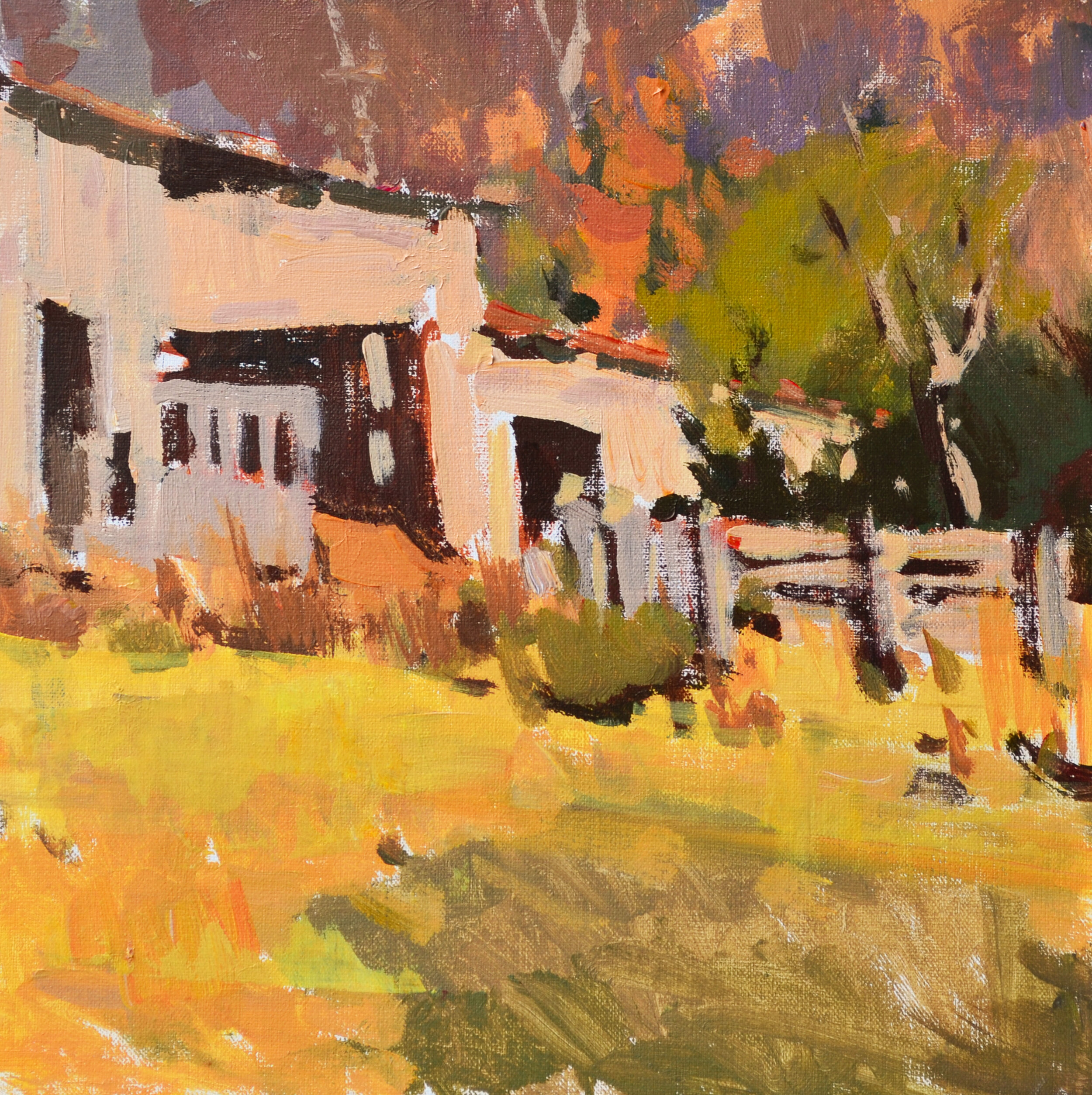
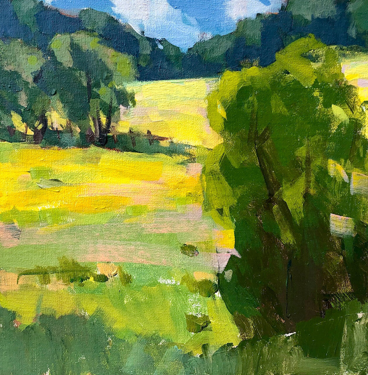
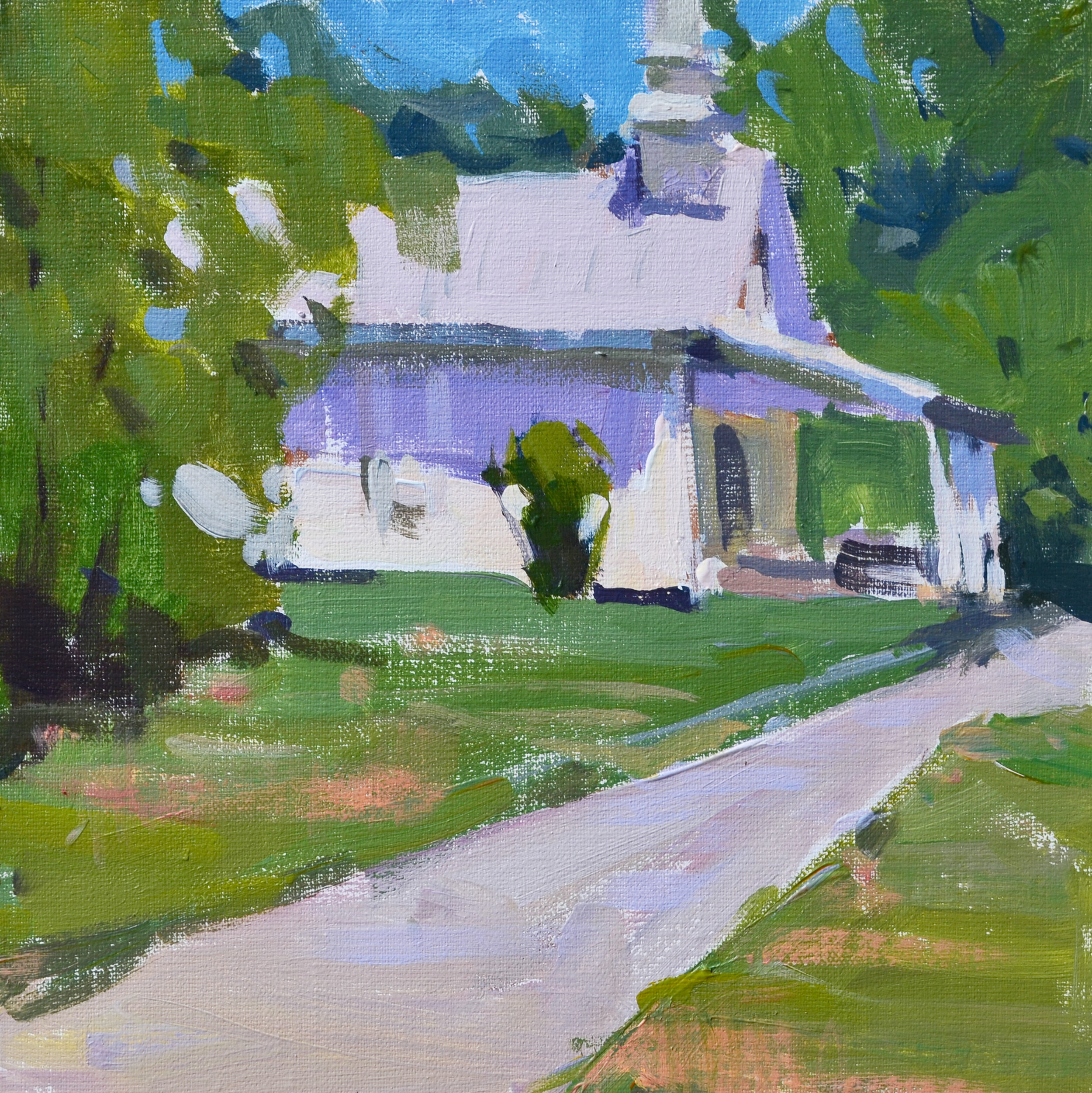
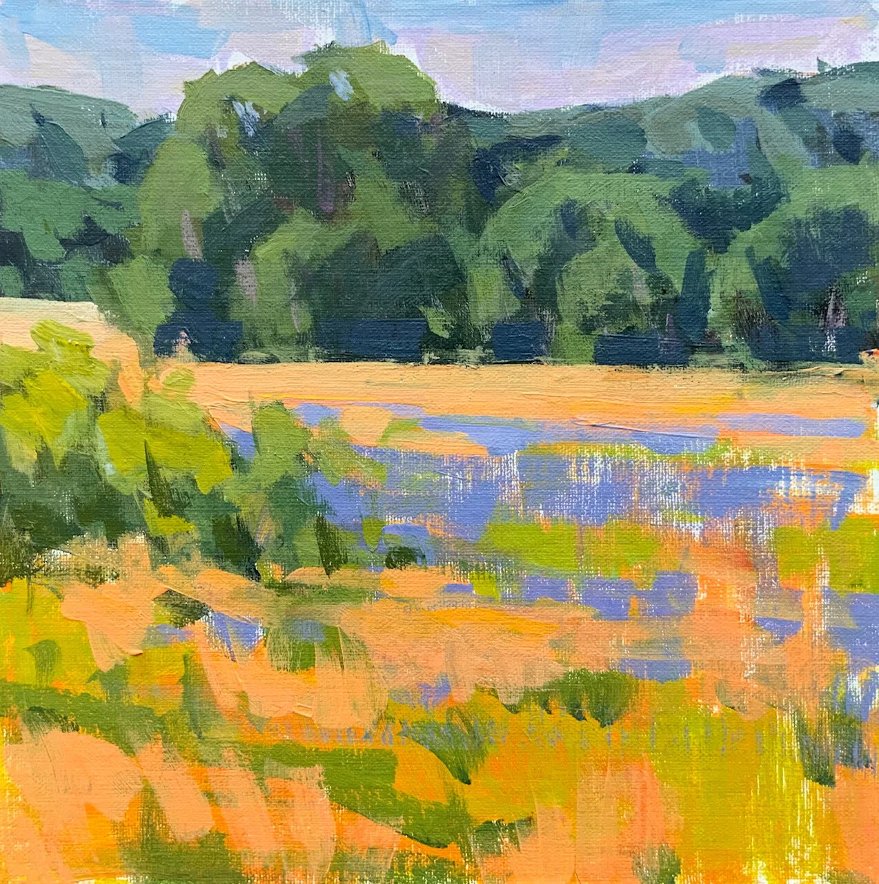
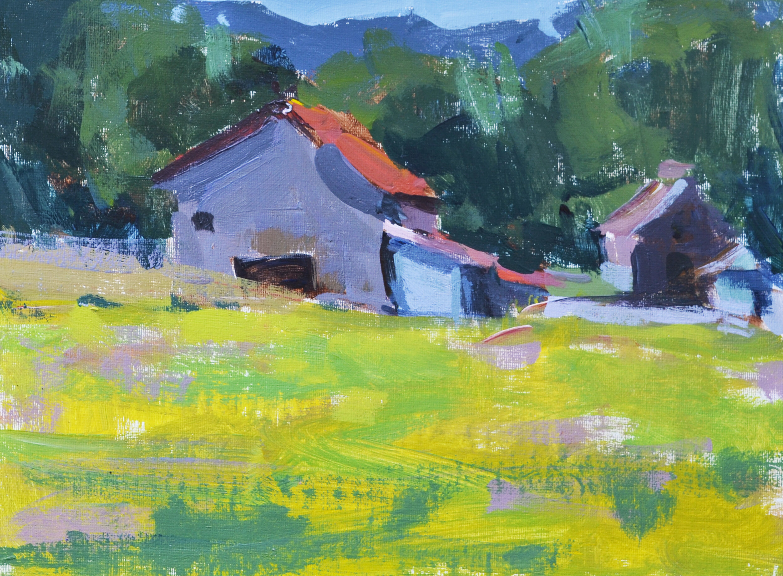
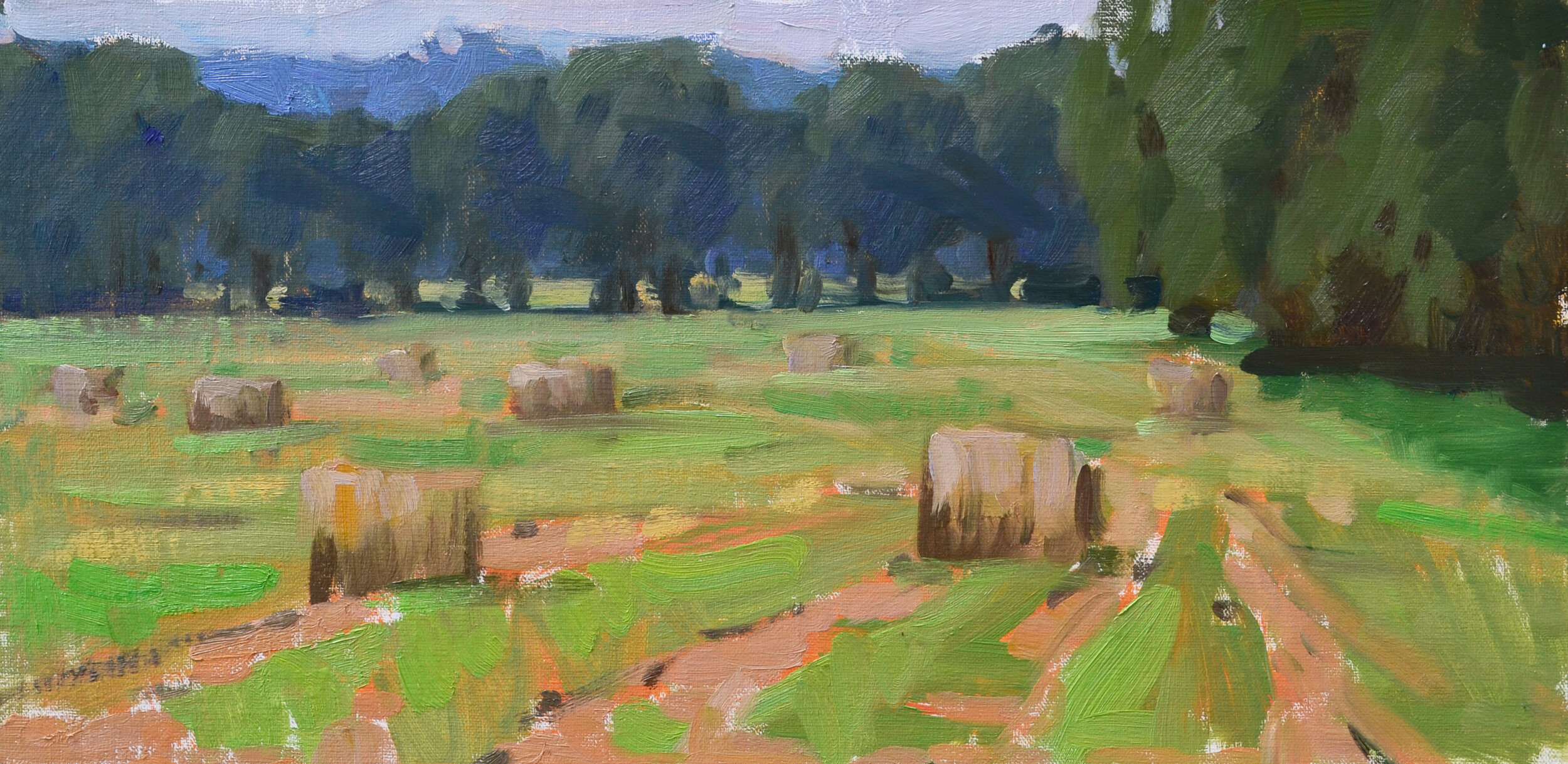
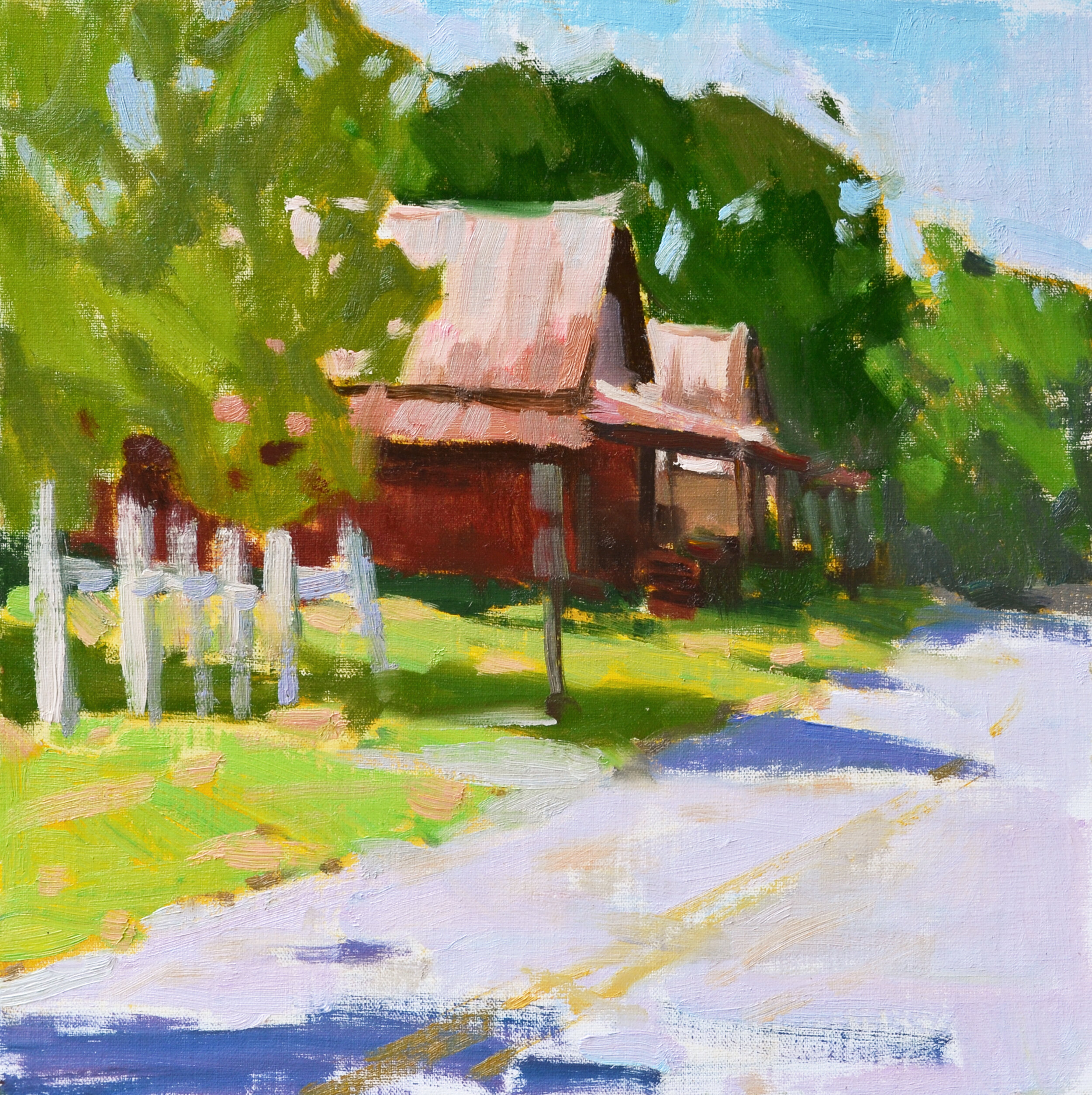
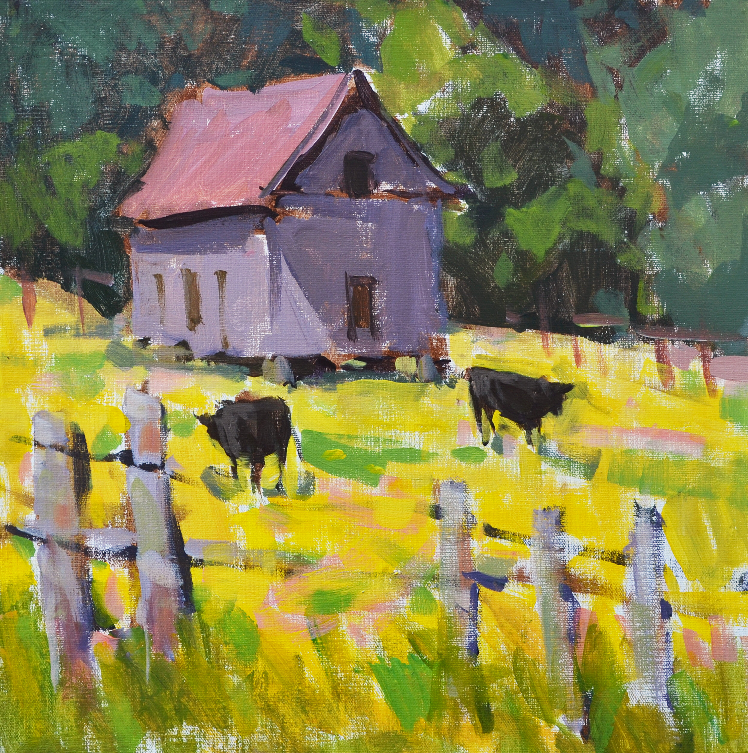
Using the Grey Matters Paper Palette allows super easy cleanup. No scraping! When I am done painting, I just rip off the used sheet and throw it in my lightweight mesh trash bag. I usually squeeze out just enough acrylic paint for one small study, but sometimes I have leftovers. In that case I’ll do a quick 6x8 to use the paint up (see picts). If using oils, it’s good to save your leftovers to use for a go-to grey, so you could have one area on your palette where you save the remaining paint or bring a tiny receptacle to store it. Regarding brushes, I find synthetic brushes are great for acrylics, but anything will do. When painting with oils, I use multiple brushes to keep the paint clean, but with acrylics that is not ideal as the paint dries in the brushes quickly. So, when using acrylics, I just use one brush and clean it frequently. Oh, and the mini spritzer is for the paint on the palette…a few spritzes as you paint helps the paint stay buttery.
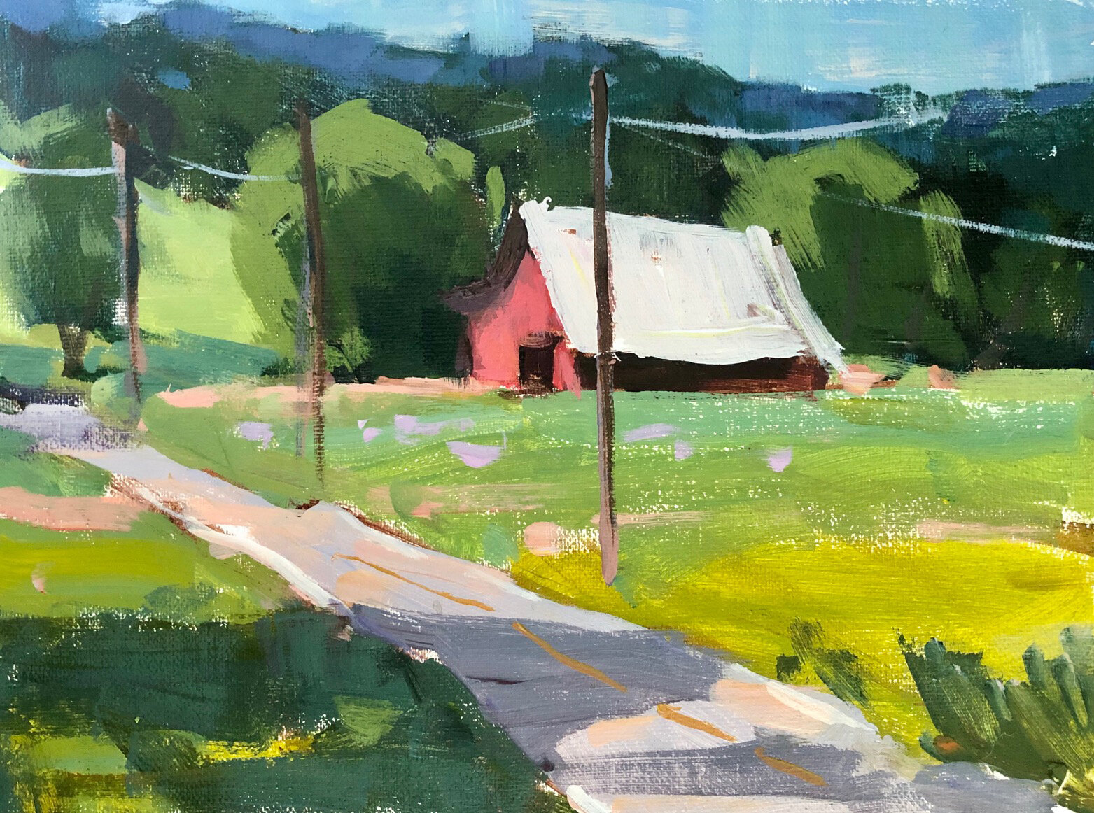
Let’s talk about my new favorite thing, the Canson Canva Artboards. The boards are stamped paper that mimics canvas. I find the surface smooth enough to get the paint to glide but textured enough to highlight juicy strokes. I remove a board and mount to my pochade, then once I’ve used all of the boards within a tablet, I just loosely fit them back in the tablet shell and put a rubber band around them for travel. Obviously acrylic is great for this because the paint will dry immediately, and you can transport easily. If you are using oil paint, this is where you would want to have some sort of panel carrier.
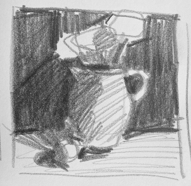
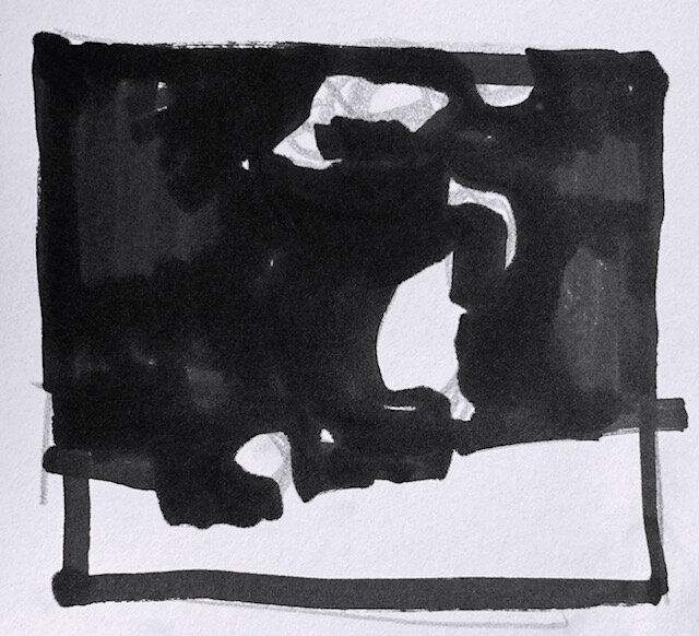
The orange hook thing-y you see in the photos is just a paint can clip (it works great as most other clips I’ve used with other pochades don’t fit the U.Go). The backpack is just an example of how small you can go, but I do use a slightly larger one. Last but not least, I always do a quick series of sketches before I paint, usually in the form of Contour Drawings. This practice helps me get to know the subject and makes for a smoother painting experience. All you need is a marker and a small sketchpad.
I hope this information is helpful to you! Less is truly is more when painting in the field, and limiting your equipment just makes the whole experience more efficient and therefore pleasurable.
If you are curious about acrylics or already use them and want to up your plein air practice, join me for Mastering Acrylics, in-person workshop April 24-26, 2026 at Bluebird Hill Retreat! You can also catch me online next March during Acrylic Live.


Resources:
Travel Tripods- https://www.bhphotovideo.com/
Artboards, Brushes, Artists’ Tape, Grey Matters Paper Palette- Dick Blick or Jerry’s Artarama https://www.dickblick.com/, https://www.jerrysartarama.com/
U.Go Pochade- https://www.jerrysartarama.com/, https://newwaveart.com/collections/u-go-plein-air-anywhere-pochade-boxes
Mesh Trash Bag- https://artworkessentials.com/accessories.html