7 Tips For Using Photo Reference in the Studio
Painting from life, whether outdoors or in, is the single most important practice for an artist. Only by direct observation can we truly learn to see depth, perspective, and atmosphere. However, it is not always possible to get outdoors or even set up a still life. Also, sometimes a certain subject matter dictates painting from photo reference. I faced this fact early on when I was primarily painting restaurant interiors. I was interested in capturing the waiters’ movement, but setting up an easel in a frenetic, noisy place is less than ideal, for the artist as well as the staff and patrons. This is where I channeled my years of painting the figure from life.
It is my belief that if you make painting from life a consistent practice, you will have more experience translating photos into vibrant, atmospheric paintings in the studio. Having said that, there are many other ways around the pitfalls of painting from photo reference that can help. Here are some methods I employ to give life-like energy to studio paintings:
1. Set a 30 minute timer. This will keep you in the moment to make quick decisions, which will also pull you away from stringently copying the photo. After each 30 minutes, take a break, step back and check your values and color.
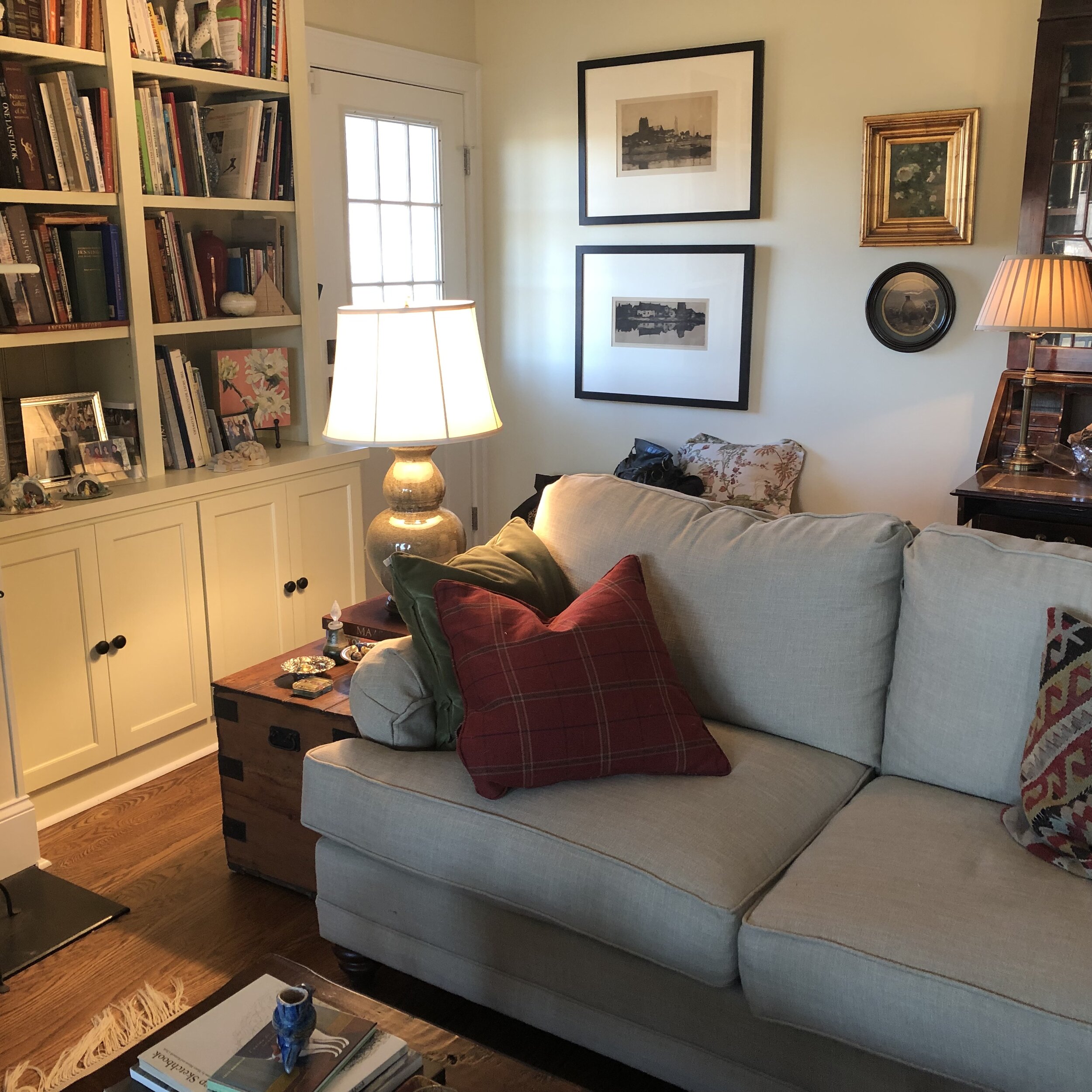
2. Don’t be a slave to the photo. Use small plein air studies to inform your studio paintings. I prop up a plein air study on my easel next to my canvas and try to work from that in the beginning. I then set up my iPad with the photo reference and set the display to fade out in 15 minutes, still only glancing at the photo reference. You can also forego the iPad and solely use the plein air piece as reference, using your imagination and sense memory to paint a larger painting.
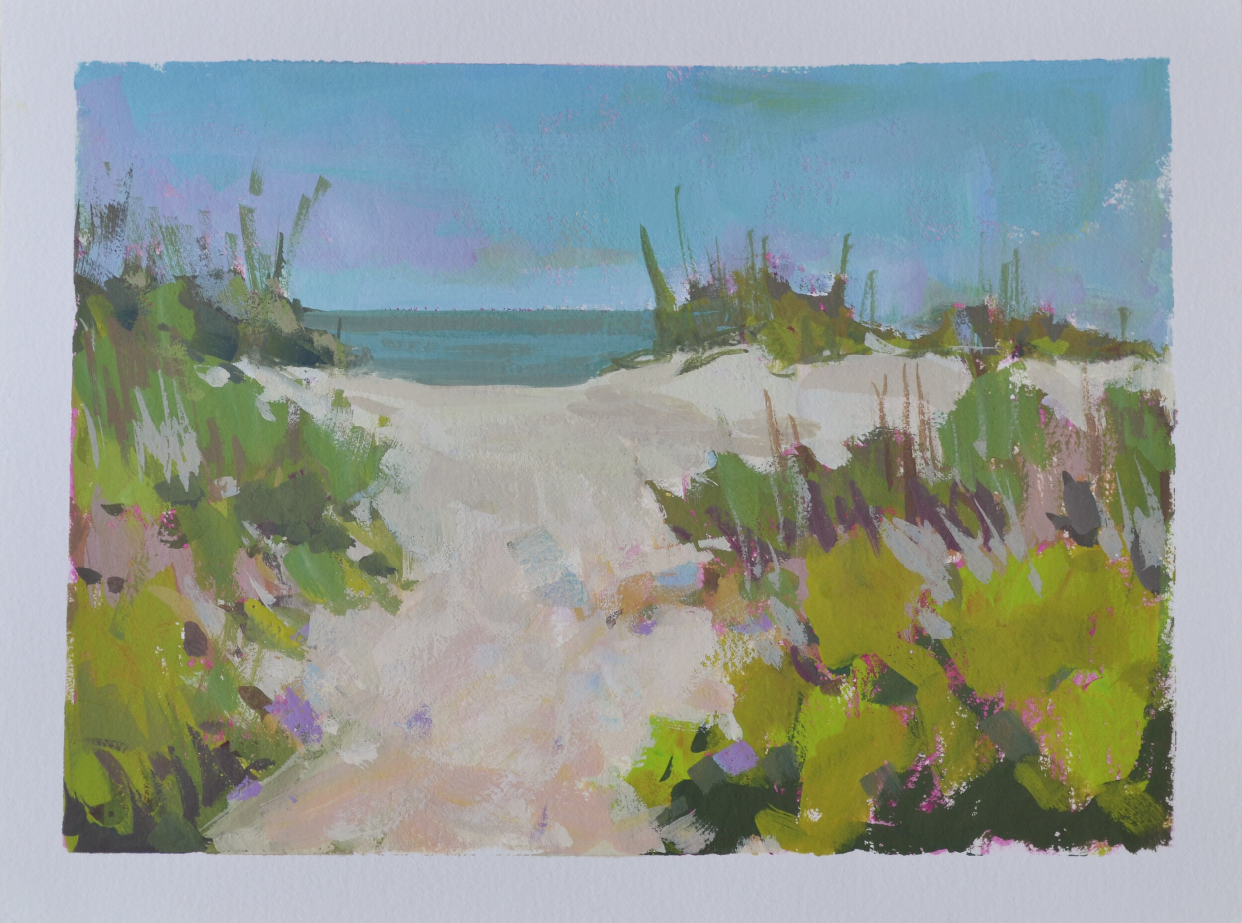
3. Consider painting small preliminary studies even if you are solely working from a photograph and edit, edit, edit. I like to play with gouache or acrylic to explore color notes, then use that study to inform the direction of the larger painting. The Gouache or Acrylic mediums are helpful for quick studies because they dry fast and you can continually edit on the spot. I also find myself personalizing the colors in this smaller format, rather than copying what I see in the photo (which is a big ‘ole lie anyway).
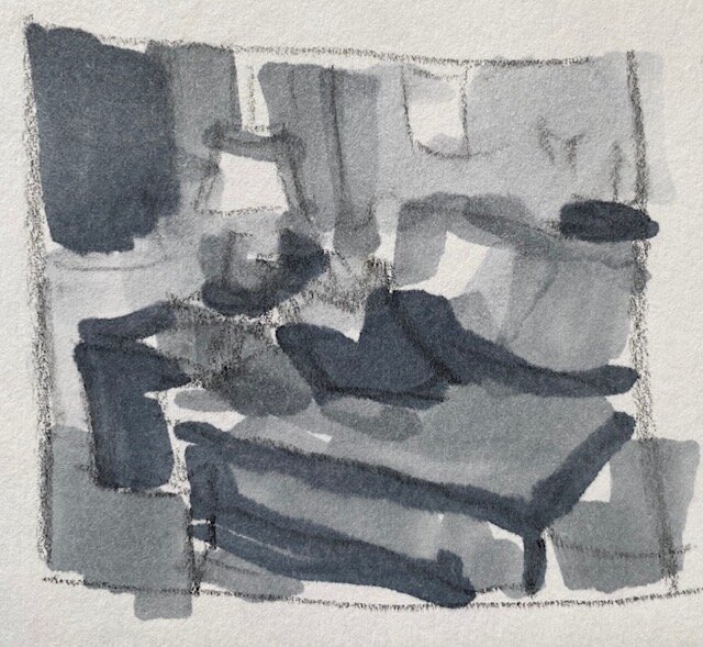
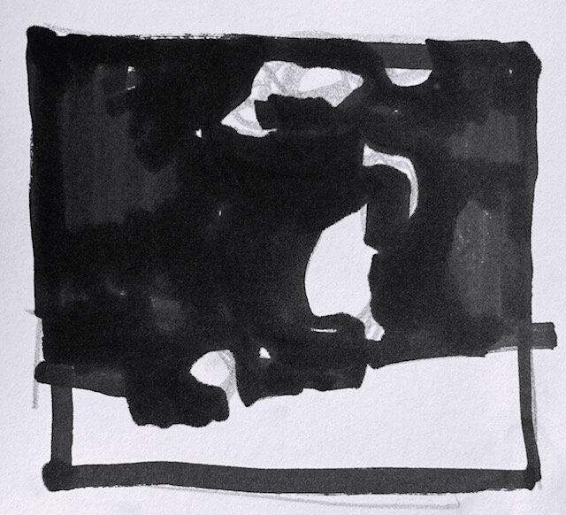
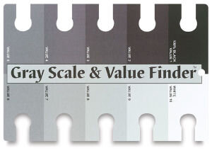
4. Speaking of big ‘ole lies, in photographic reference, shadows appear too dark and lights look blown out or too white. In my experience, it is all too easy to get seduced into copying those distorted values, getting harsh black shadows and chalky lights. I suggest painting a small black & white study, referring to a 9 value scale to control the values. Look at the scale and scootch down on the dark end and choose a dark grey for the darkest dark instead of black. Then hippety-hop down the scale further to key the mid-tones and lights. Regarding the too-white-lights, do the reverse. So basically you are working within the 7 middle values. Then you can use this black & white study to inform your color mixing.
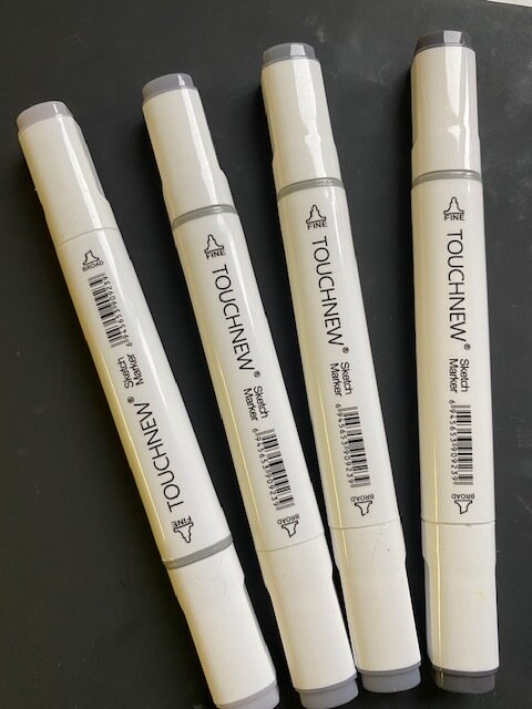
5. I often employ the aforementioned pick-your-key-on-the-value-scale approach by drawing preliminary greyscale marker sketches. If you feel the darks in your photo are distorted, pick a dark-ish grey marker instead of black and then key the rest of the values as mentioned in tip #4. If the light looks too white, peek at the slightly darker value to the left of white (or further up the scale) and see if that would be better. I suggest four markers. Limited choices streamline the value decisions.
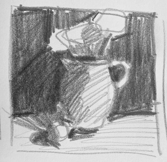
6. Draw preliminary Notan sketches. Here is where stark black & white is our friend. Notan is a Japanese term which literally means "light dark harmony”. If you see in only two values first, it’s easier to see the underlying abstract design of a scene. This will help you simplify your scene right out of the gate and pull you away from rendering or copying all the “stuff”.
7. Turn your canvas upside down. Yep, you read that right. This will help you identify shapes in the photo and not copy “stuff”. My method for this practice is to wash in a monochromatic underpainting right side up (creating a design/road map), then flip the canvas and paint 70/30, that is 70% of the painting time is with upside down canvas, 30% turned right side up. I recommend the aforementioned preliminary Greyscale Marker sketches to help identify the value structure, and set that timer! :-)
In the image gallery below, you will see from top left to right:
1. Plein Air study, green house
2. Larger studio painting from green house study
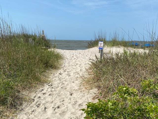
3. Gouache study, beach path
4. Larger painting using Gouache study as reference
5. Greyscale marker sketch with dark grey as darkest dark
6. Greyscale marker pict
7. Pitcher & Fruit value sketch and Notan sketch
8. Photo reference for both the beach path paintings and the interior greyscale sketches
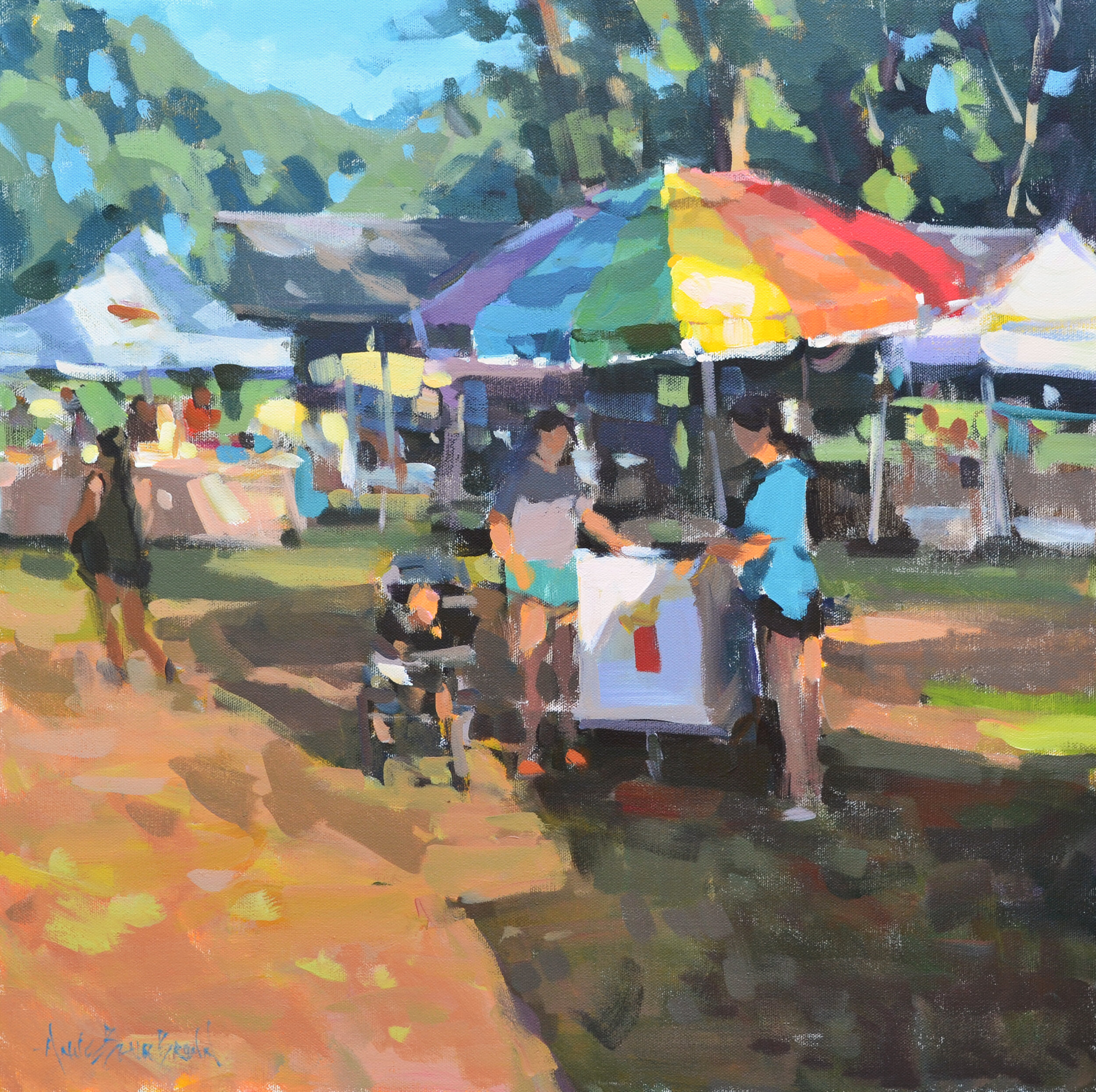
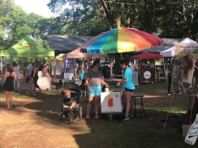
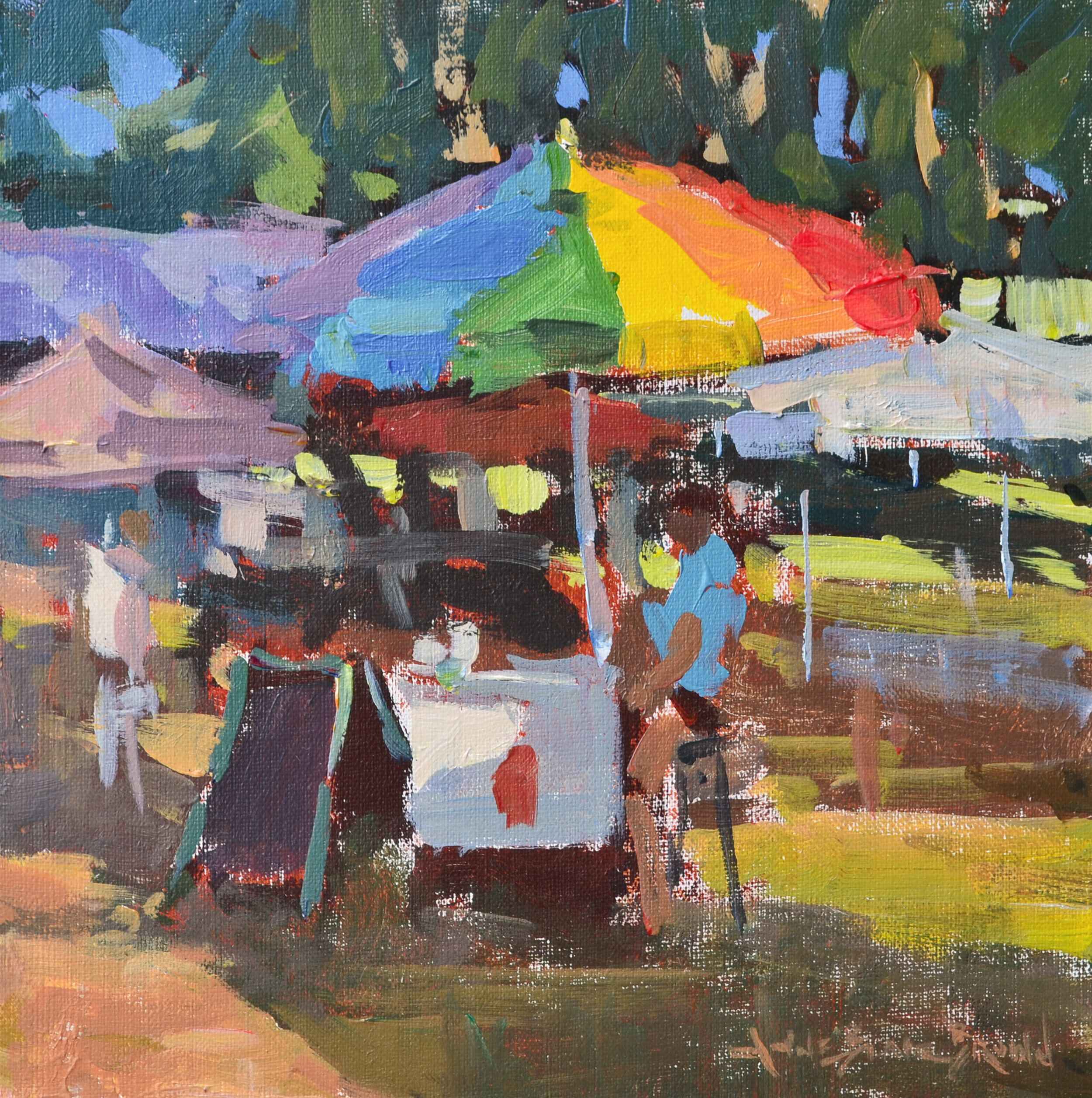
9. Larger umbrella painting using the study at the top of this page as reference.
10. 9-Value Scale
11. Photo reference for umbrella study and larger painting